

Full visual identity · 2021
Friendship Association for the Blind
A visual language rooted in Braille.
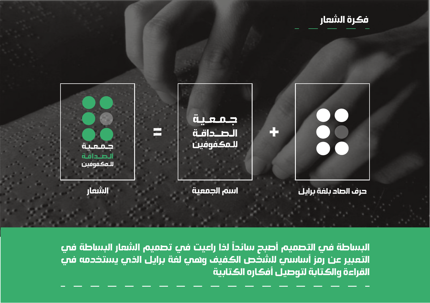
From a letter to an identity.
Designed in 2021, this complete identity connects the association’s name with Braille. Its six-dot structure becomes the starting point for a consistent system spanning the mark, supporting graphics, stationery and awareness publications.
The design brings a shared visual language to different types of communication while keeping the association’s Arabic name central.
- Year
- 2021
- Designer
- Anas Migdadi
- Role
- Complete visual identity design
- Deliverables
- Logo, brand guidelines, patterns, stationery and awareness print design.
The mark
The identity guide connects the Arabic letter ṣād (ص), the first letter of الصداقة, with its Braille form. Paired with the association’s name, it becomes the core signature.
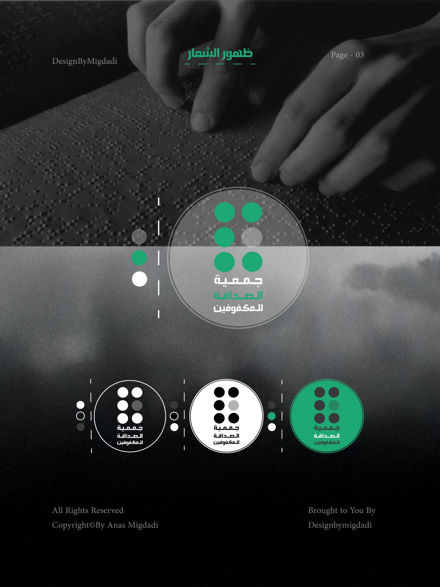
A connected visual system
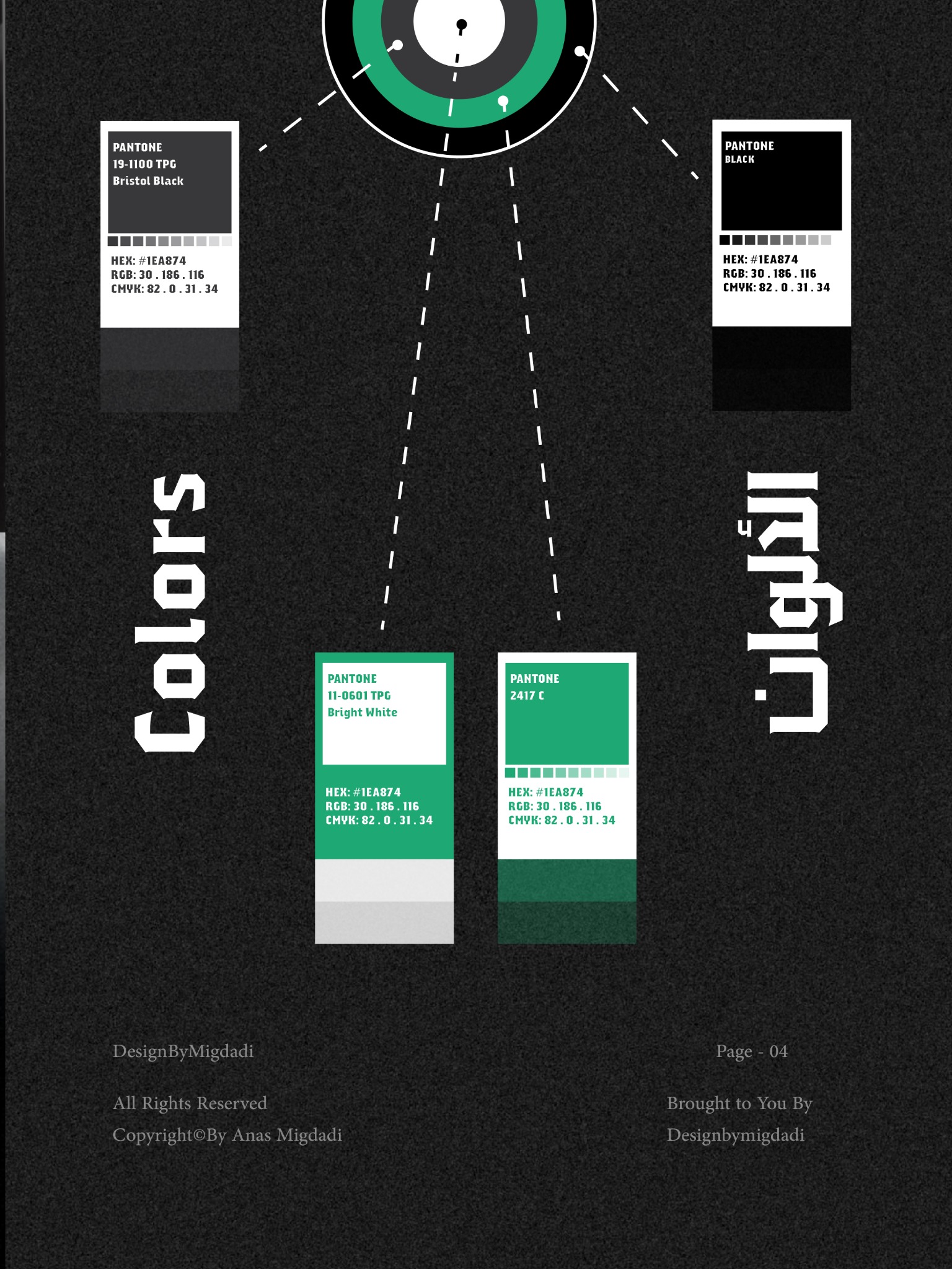
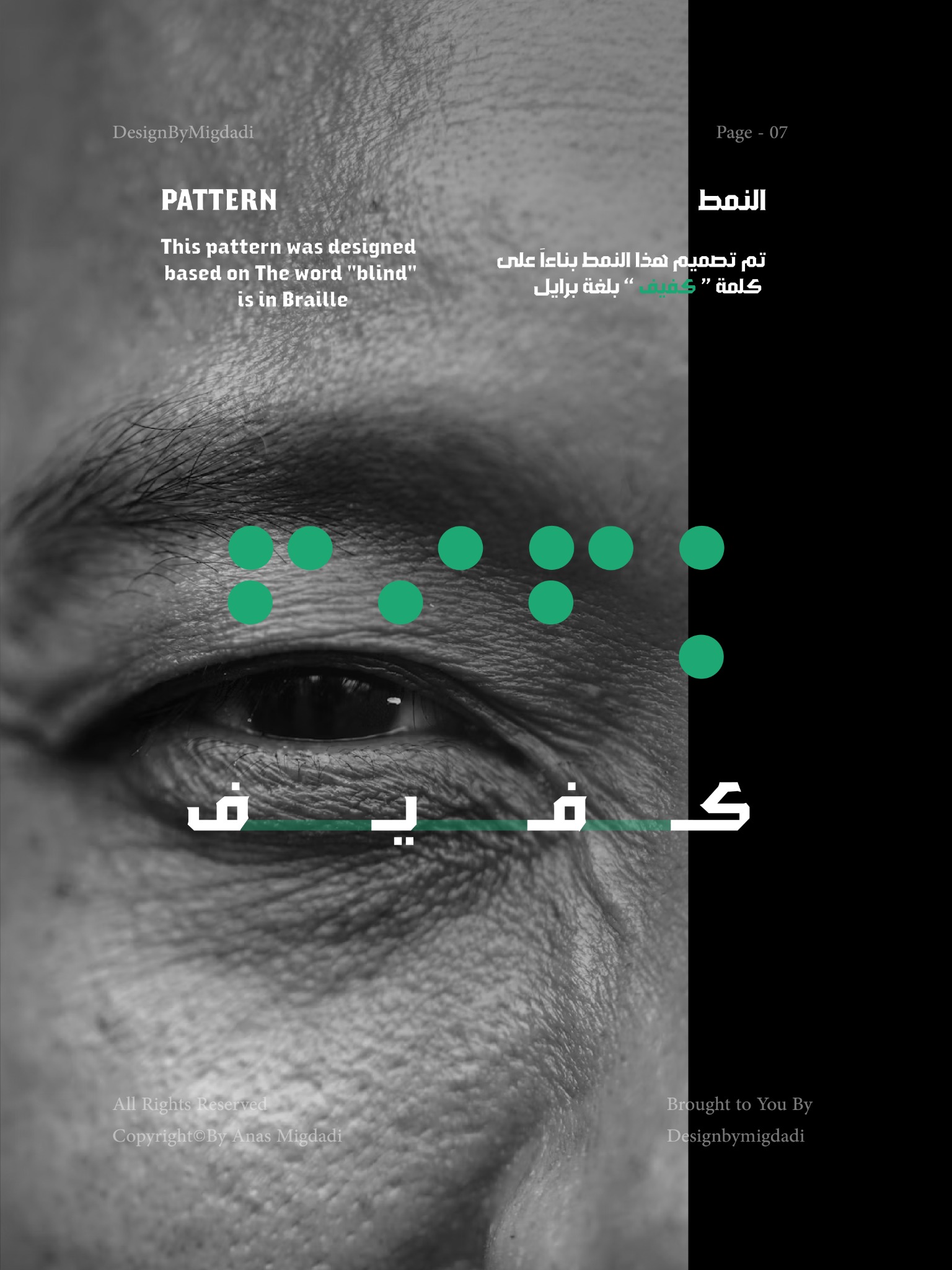
Green, black, white and gray unite the applications. The supporting pattern is based on the Arabic word كفيف in Braille, as documented in the brand guide.
Printed communication
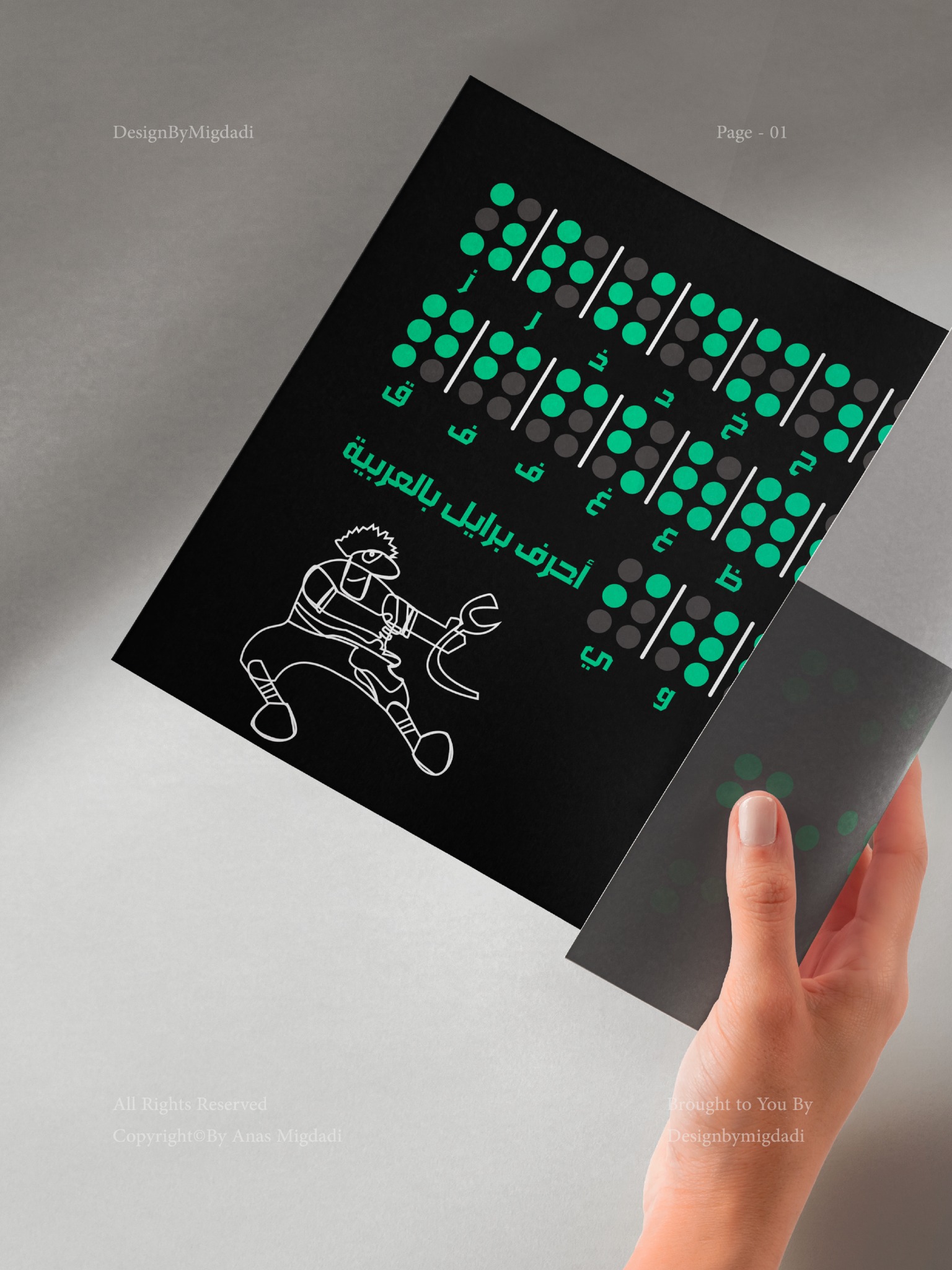
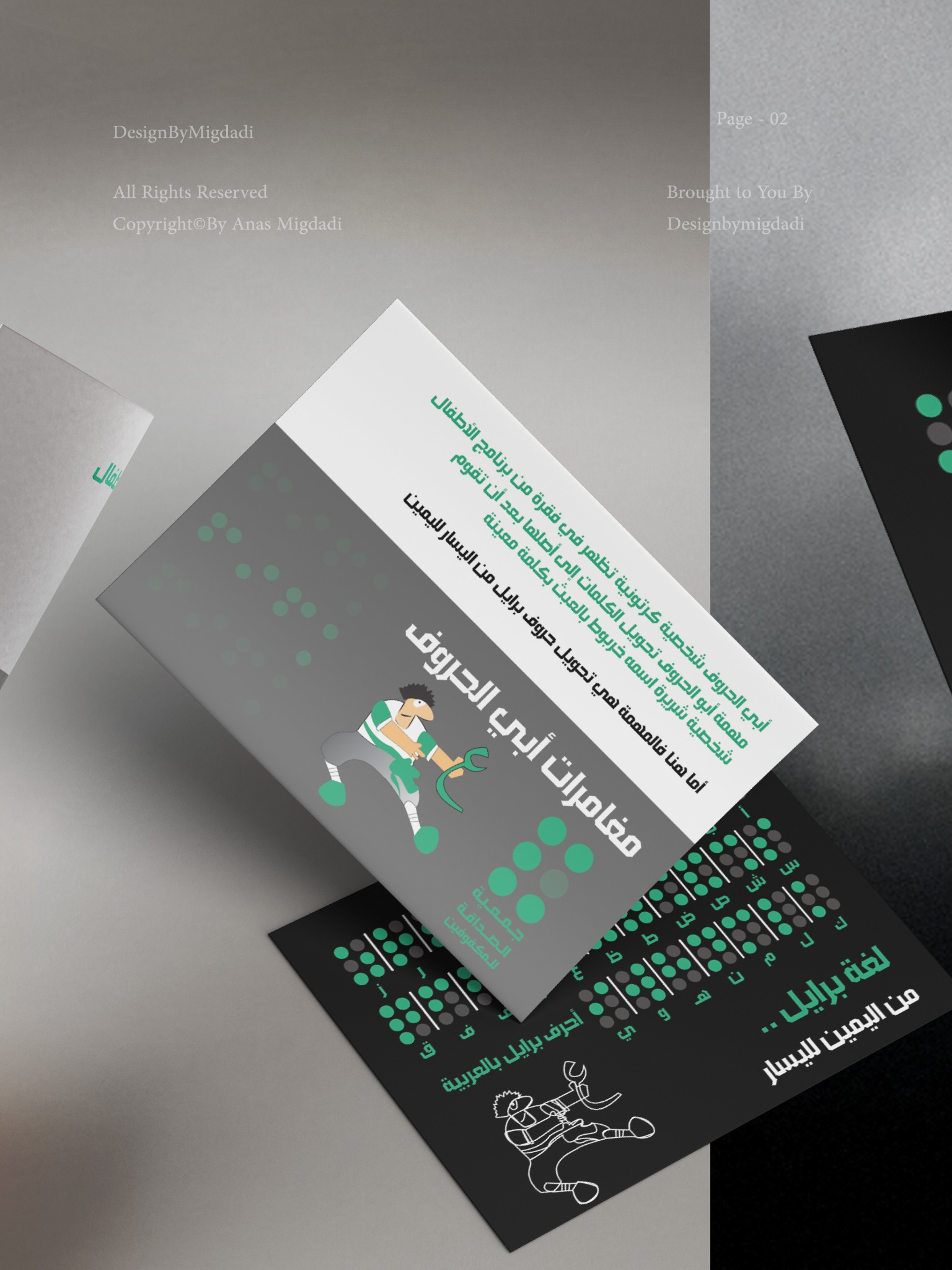
The dot pattern links educational cards and folded publications. Bold Arabic headings and a controlled color palette give different formats a recognizable family resemblance.
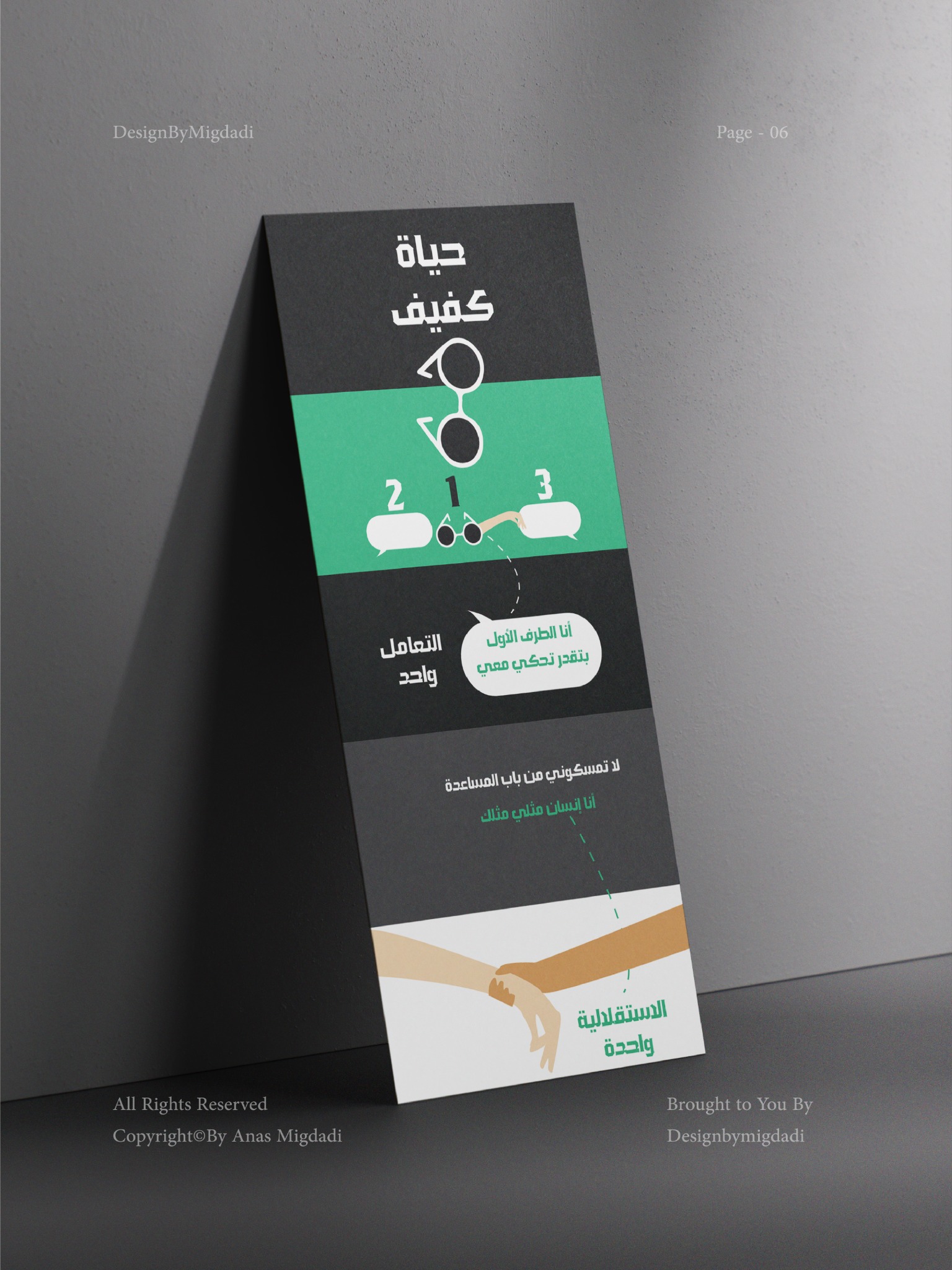
An editorial extension
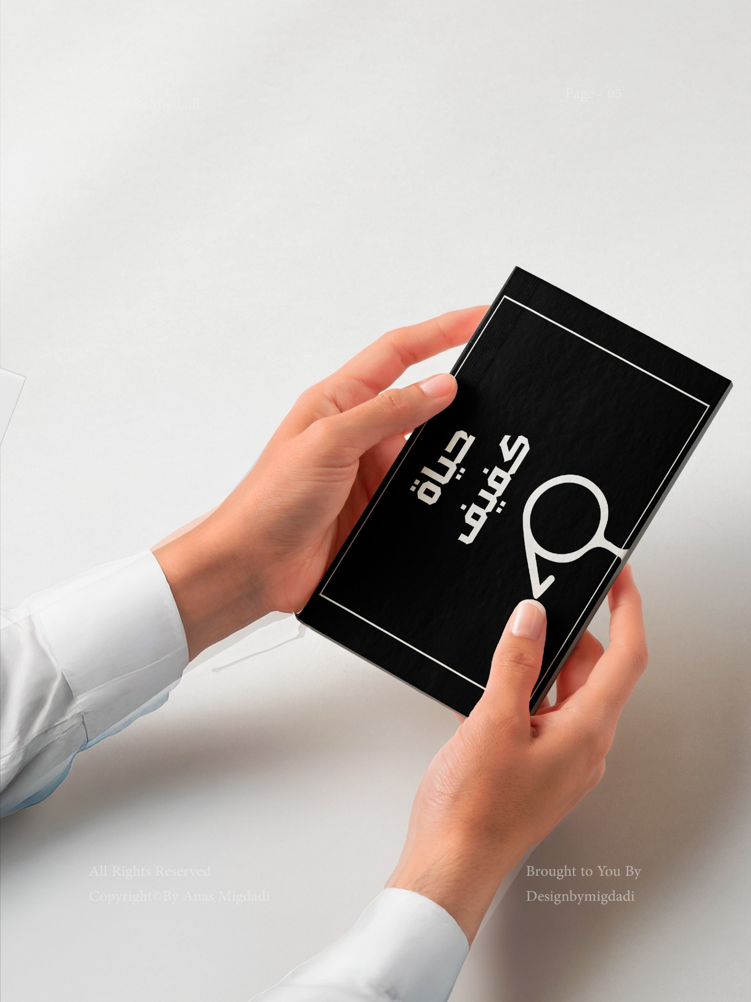
The booklet extends the system into longer reading: section headings, illustrations, information graphics and recurring Braille motifs. These spreads are presented as examples of the 2021 design, not as current statistical references.
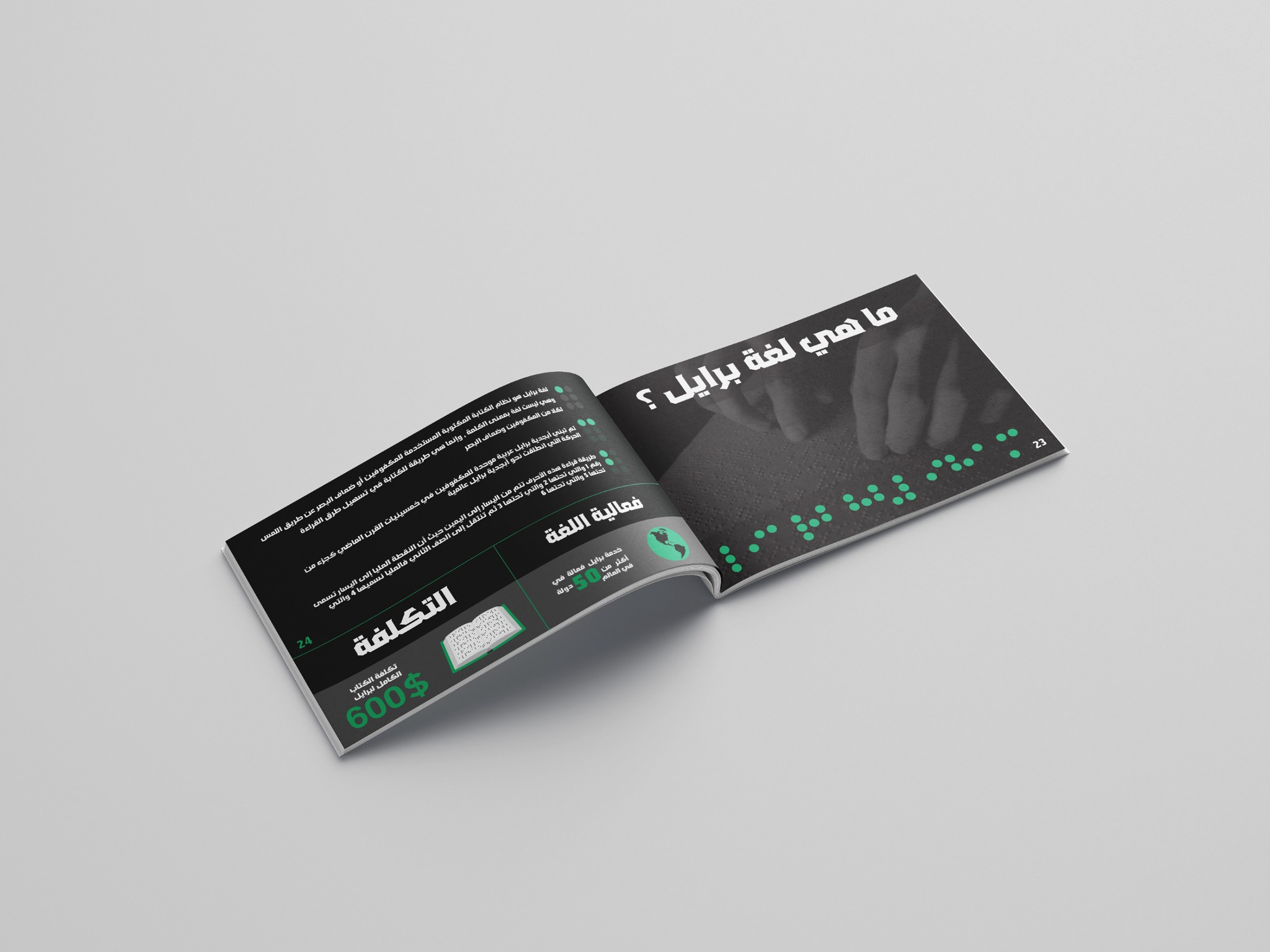
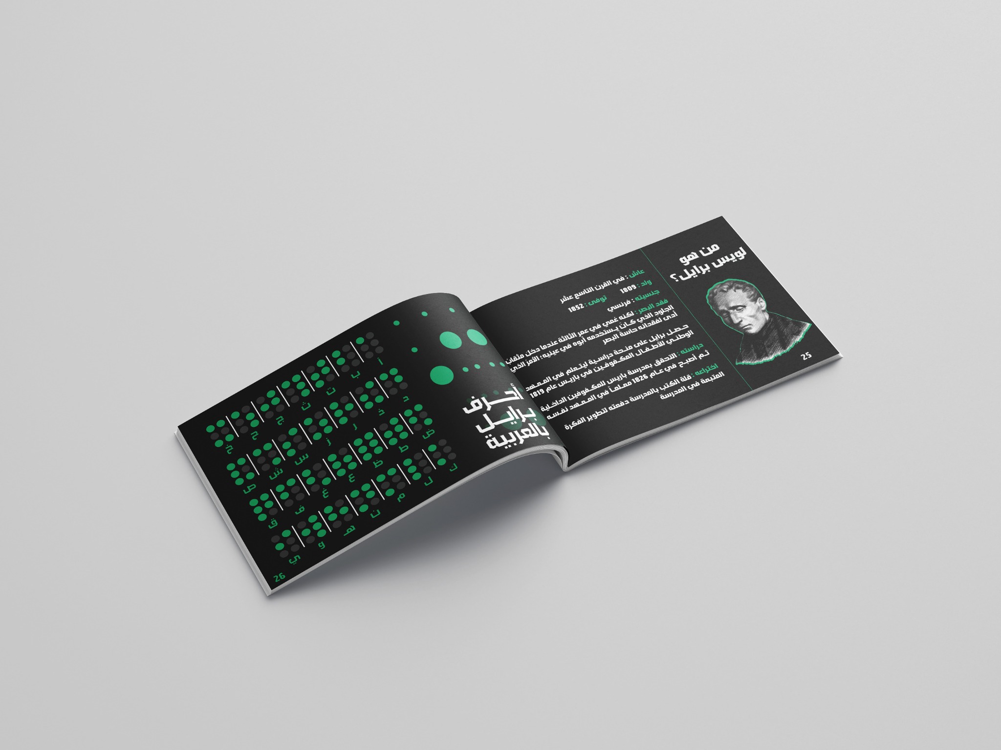
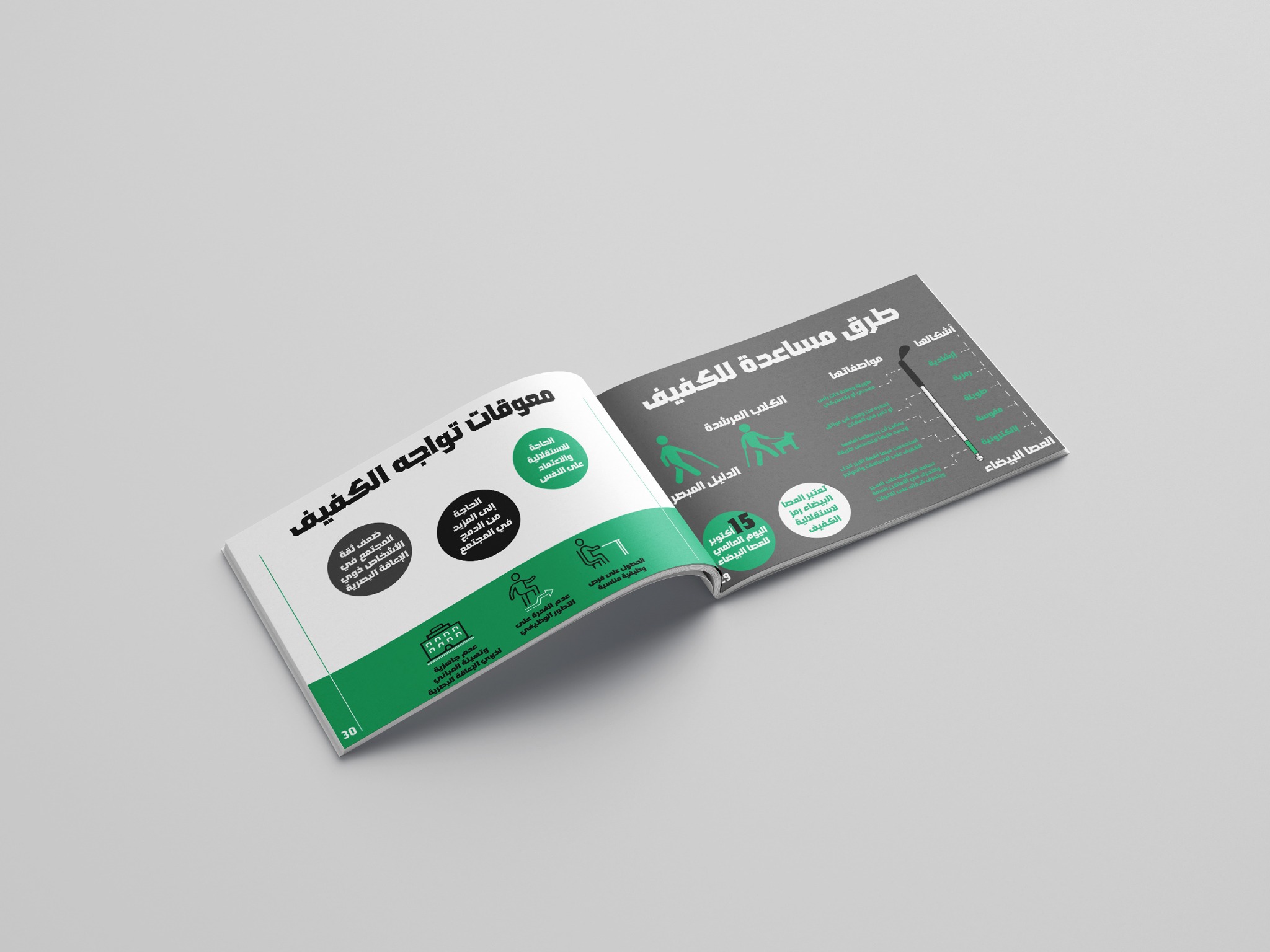
Design by Anas Migdadi · 2021
One system, across every format.
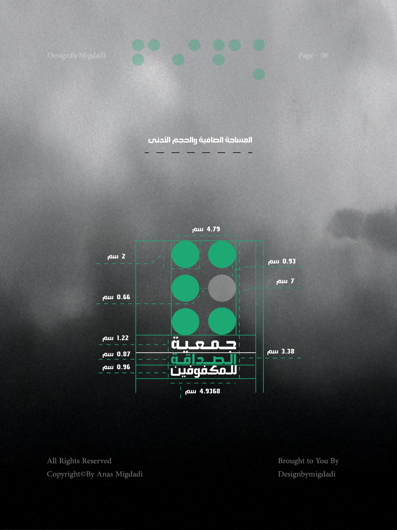
A complete visual identity, supported by a guide to the logo, clear space, color, typography and graphic elements.
Explore all work